LSPA Project
- Client
- LSPA
- Website
- Visit site
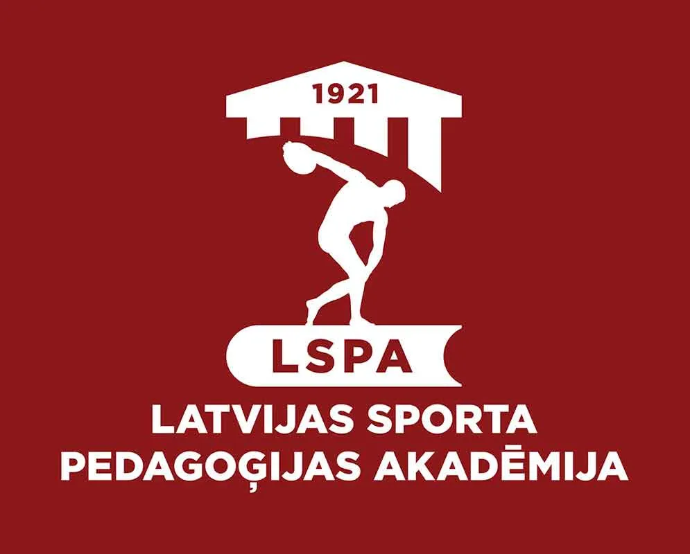
LSPA — the Latvian Academy of Sport Education, founded in 1921 — came to us for a full identity refresh. The brief kept every symbol the academy's own charter requires (the four-column facade, the discus-thrower silhouette, the LSPA initials) and rebuilt them as a cleaner, single-colour mark that still reads at t-shirt-logo size.
Before & After
The original logo had complex symbolism in fine line art and a sculptural style. I transformed it into dense, monolithic forms and simplified the columnar construction – this allowed me to preserve every important detail while achieving excellent legibility even in tiny formats.
Before and after
Building the Mark
Each piece has its own meaning, set out in the academy's own charter: the facade for the building where knowledge is gained, the discus thrower — after the ancient Greek sculptor Myron's Discobolus — for physical and mental strength, the book for accumulated learning, and 1921 for the academy's founding year. The proportions themselves follow the golden ratio, traced directly from the Discobolus figure.
Identity System
The guide runs to an English lockup for international use, plus every practical application — email signatures, letterheads, presentation templates — needed to keep the mark consistent across the academy's day-to-day communication.
Applications
The pattern running through the mark's coursework — a repeating runner motif drawn from the discus thrower — carried onto sports apparel in the academy's colours, for both men's and women's team kits.
More shots from this project