ABM Agro Project
- Client
- ABM Agro
- Website
- Visit site
ABM Agro manages private capital investment in Latvian farmland — close to 4,000 hectares of agricultural and forest land across the country. We built the brand from the sketch pad up: a wordmark, a full visual identity system, and the website that carries it.
Logo Design
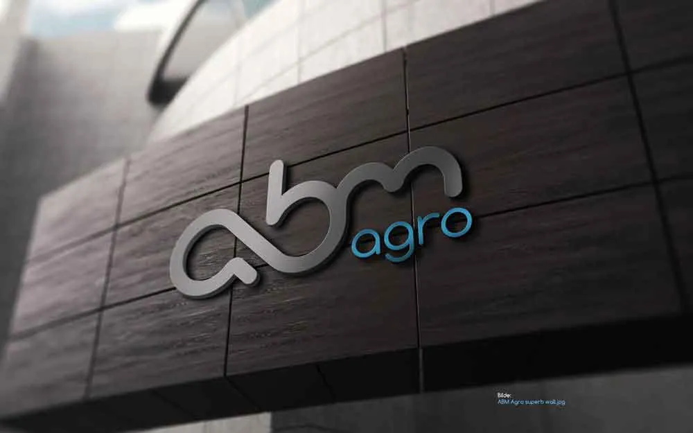
The mark went through dozens of hand-drawn passes before landing on its final form — letters built to read as both initials and a single continuous shape.
Graphic Symbols Symbology
The final logo solution is closely related to the client's sphere: it is based on the rhythm found in nature and the golden ratio proportions. The connection of the letters a and b marks the infinity sign, reflecting the same natural cycle of infinity borrowed from the spiral of a sunflower.
Identity System
The color palette is based on natural motifs - just as the gray clouds in the sky bring the blessing of rain and the power of life, the gray and light blue tones used in the logo symbolize this harmonious interaction and peace.
Website
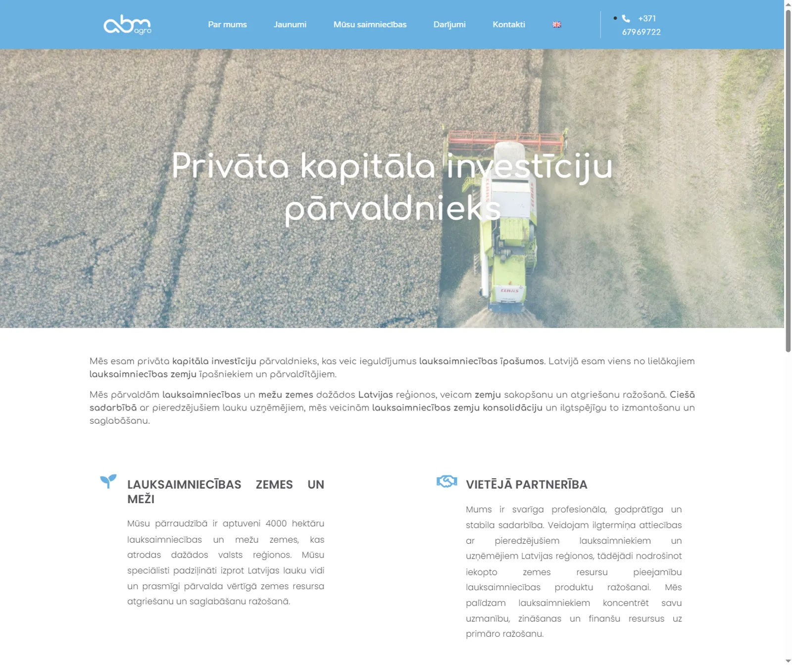
The identity carried through to abm.lv — a clean, content-first site introducing the company's investment approach and its land holdings across Latvia.
More shots from this project