
Tenjaku Gift Packaging: Japanese Design Meets AI Product Photography
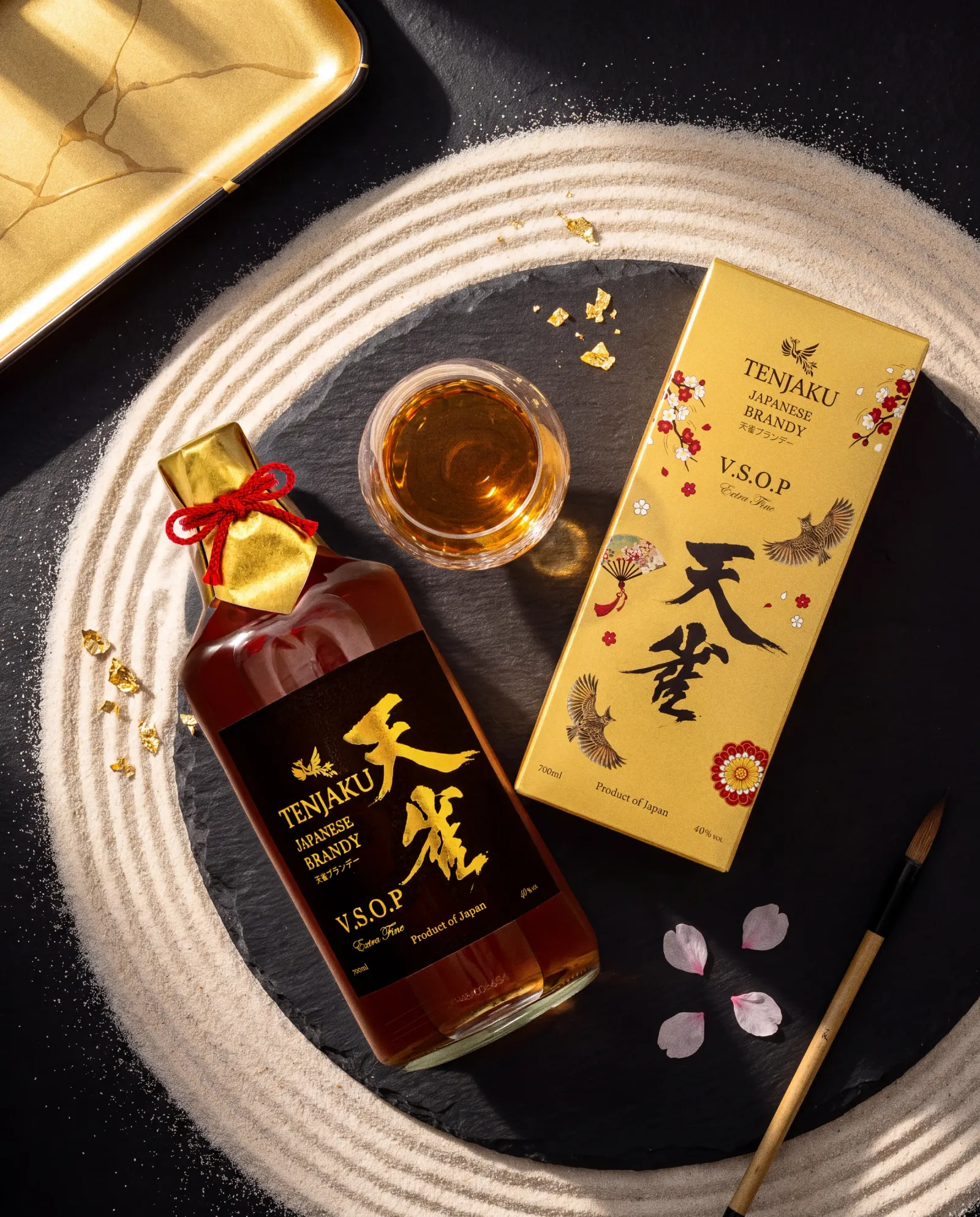
The Brief
The client came to me with a clear goal — the Tenjaku Brandy bottle needed an exclusive, gift-style package. Along with the brief, I also received the box die-line, so the exact dimensions and fold lines were known from the very start.
The design had to be Japanese in style. The base was gold paper, layered with several traditional Japanese elements: cherry blossoms, a folding fan, and a flying skylark with its wings spread wide in flight. The skylark became the box's central figure — dynamic, light, as if it had just lifted off the ground.
From Sketch to Bottle
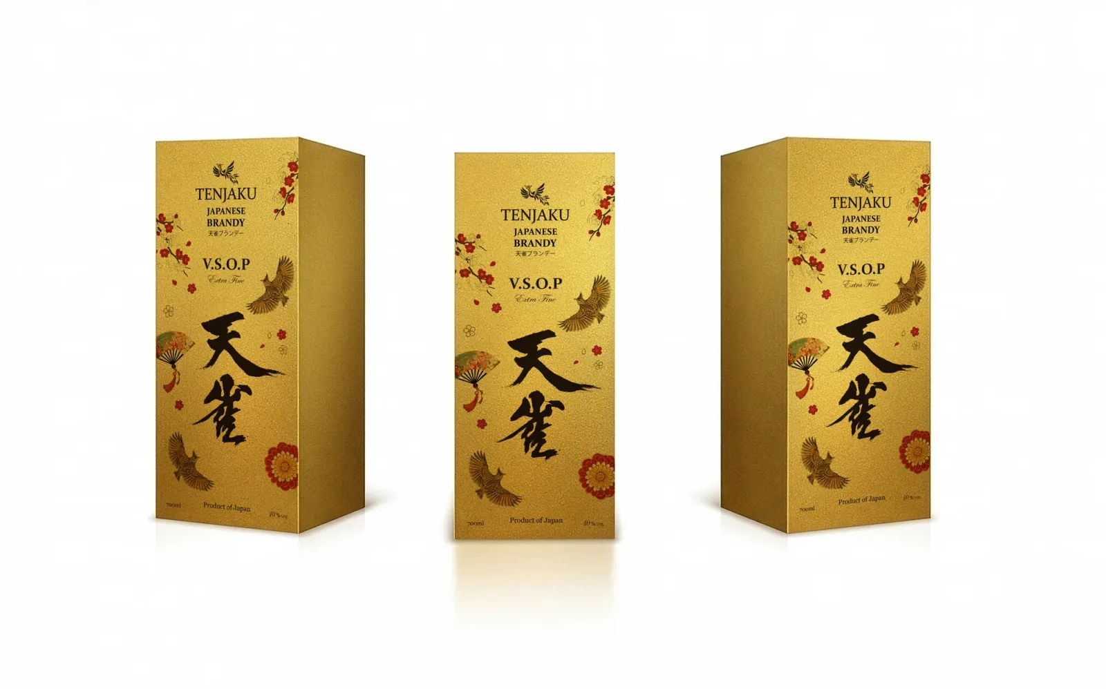
Once the design was approved and the box printed, product photography followed. The gold packaging with its black-and-gold label looks striking even without extra effects — but it was the tiny details, like the red cord at the neck, that ended up taking the most time. More on that below.
The finished Tenjaku Brandy packaging, freshly printed
The Whisky Edition — A Lighter Mood
After the brandy came the Tenjaku Whisky gift box. This time the color scheme flipped — a light, cream-toned background with black brushwork lettering standing out against it. The Japanese symbolism stayed intact: the flying skylark is again the visual centerpiece, joined by cherry-blossom branches and a small red sun in the top corner.
The packaging had to be adapted for two volumes — 700ml and 750ml — meaning two separate die-lines with slightly different proportions, but one consistent visual language.
Left — mockups for client approval; right — the finished print layout with all the required product information
Vodka, With a Winter Mood
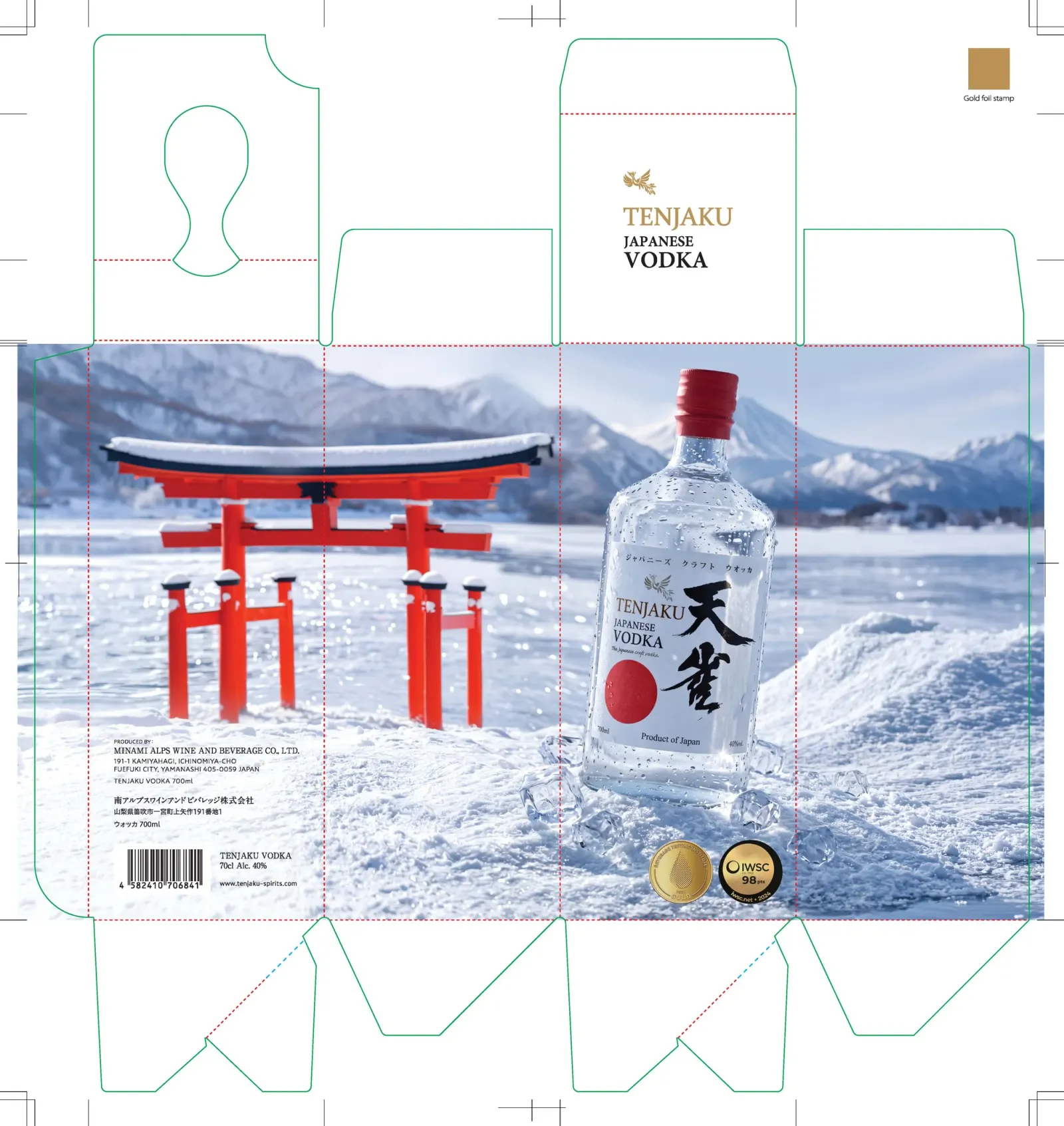
The third product in the series — Tenjaku Vodka — took on a completely different mood. Instead of continuing the gold or light theme, we went with a winter landscape: snow-capped mountains, a red torii gate, and a clear, coolly gleaming bottle up front. The result feels fresh and distinct from the other two products, while still reading as part of the same Tenjaku family.
Before locking in the final composition, I generated several AI concept variants — different framings, lighting and mountain backdrops — to find the one that best supported the bottle's shape and label.
AI-generated winter concept variants on the way to the final composition
From Print to the Studio
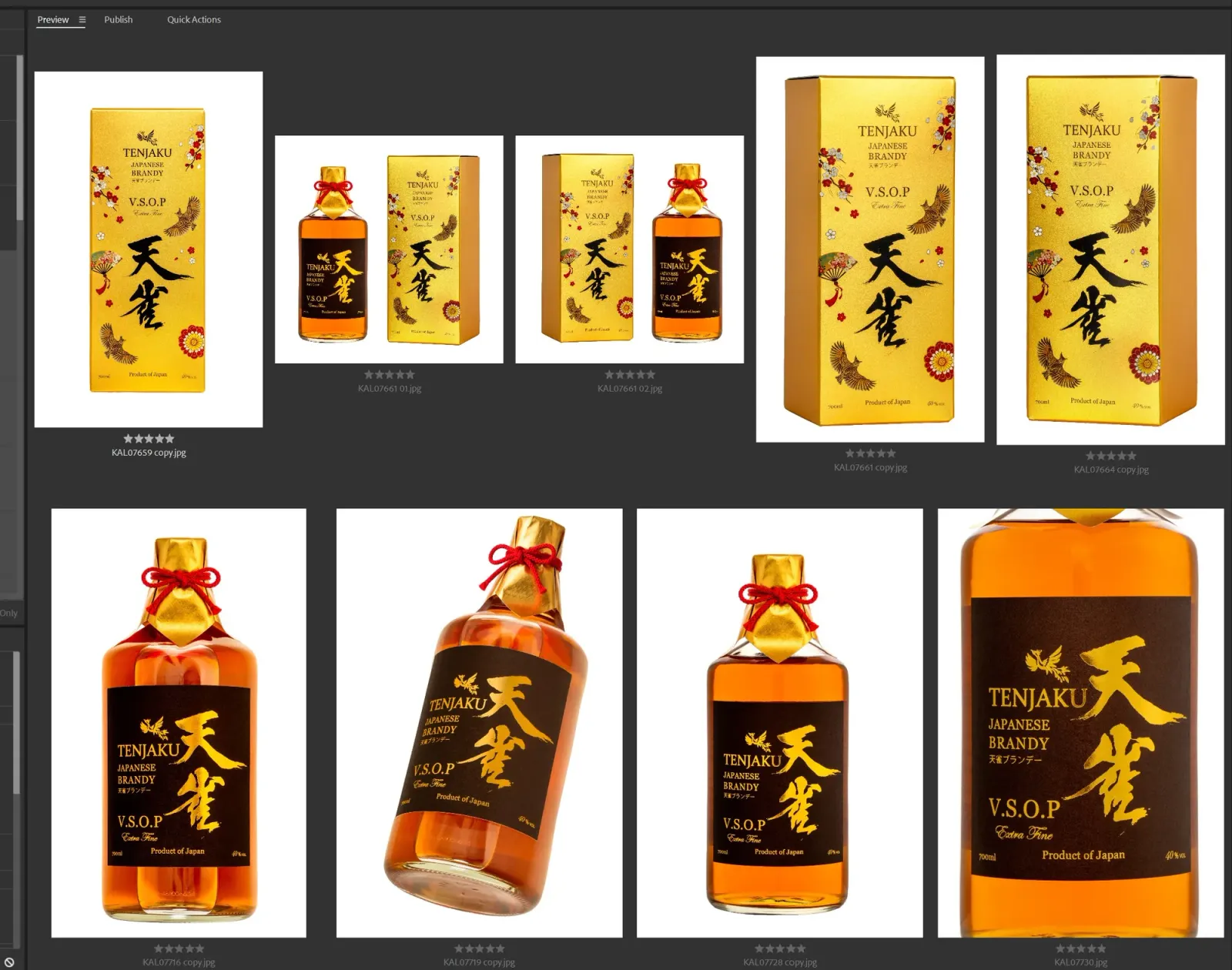
Once the packaging was printed and the bottles arrived, a full product shoot followed — multiple angles and perspectives, to cover both marketing and e-commerce needs.
The Impossible Little Cord
The seemingly simplest detail turned out to be the hardest. The bottle's neck is finished with a small red braided-cord knot — a tiny but essential piece of the Japanese aesthetic. The problem: I simply couldn't tie it perfectly symmetrical. I tried several different tying techniques, and every single result came out slightly crooked or uneven — the kind of thing that's immediately obvious in a photograph.
Left — the knot as photographed in studio, never quite symmetrical; right — the best example the client themselves sent over as a reference
How AI Solved the Knot
This is where AI stepped in. In post-production, I generated a perfectly symmetrical, clean knot and composited it back into the original photograph — so seamlessly that no viewer would ever guess it wasn't photographed that way. The result is more precise than any of my physical attempts.
Left — the reference image; right — the AI-generated result, composited back into the photo
When AI Doesn't Get It Right
To be honest, AI isn't a universal fix for everything. There are cases where it simply can't handle the task, and you have to fall back on traditional Photoshop work. Here's an attempt where the AI tried to merge the bottle's neck with the cord knot in a rather odd way — the result looks pretty funny, and a version like this would obviously never make it to the client.
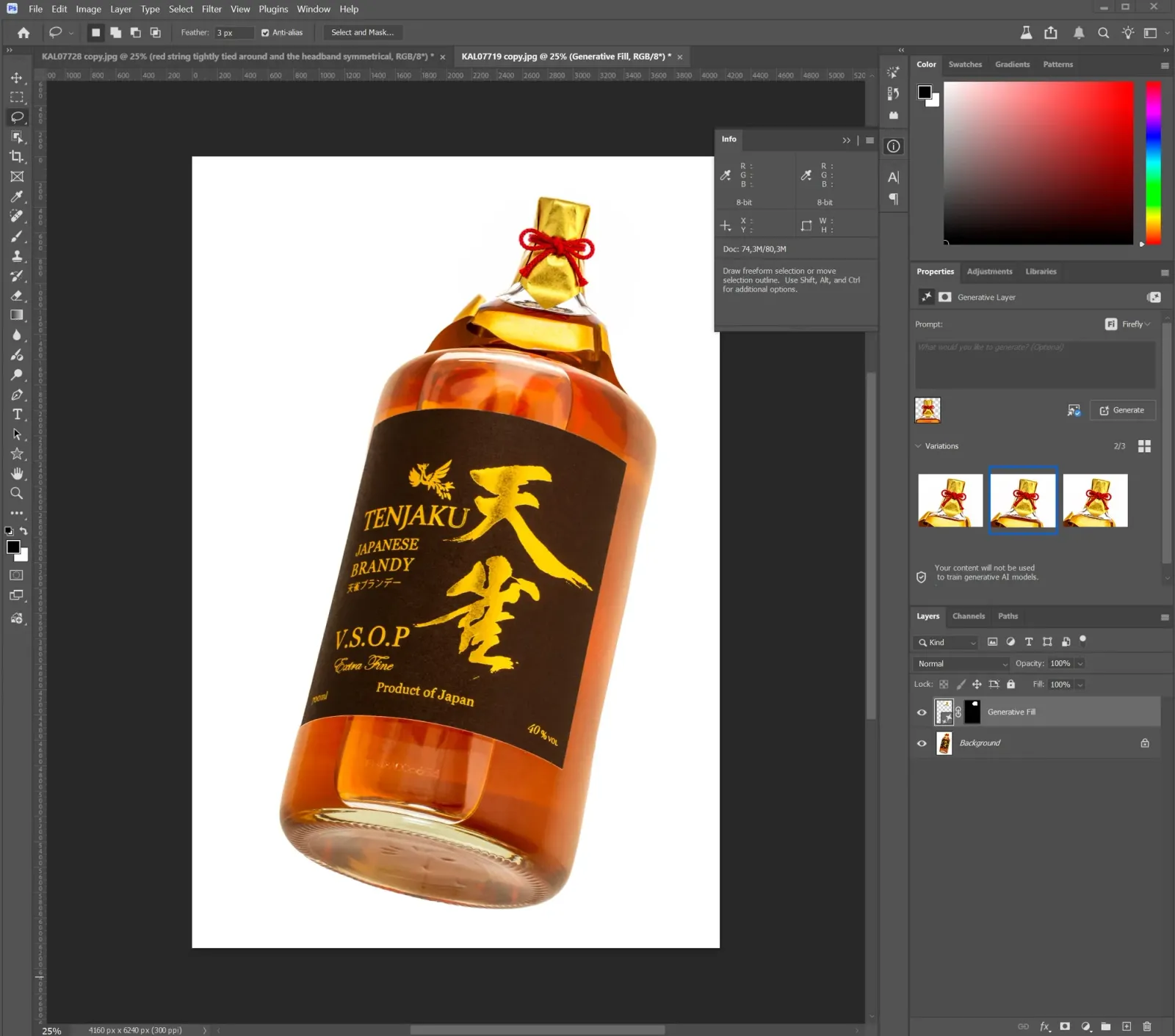
A New Way to Shoot Product Photography
Just a few years ago, a product shoot meant buying props, building a set in the studio, and spending several days to get a handful of good hero shots. Today, AI handles a large part of that work.
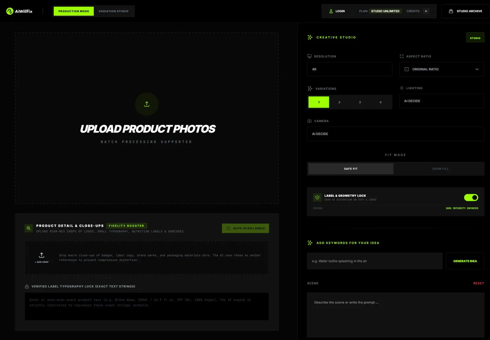
I use both Gemini and ChatGPT for image generation — the newest ChatGPT model is especially good at preserving small text within images. But for this specific need — precise product photography where every letter on a label matters — I built my own application, aiwillfix.com.
The hardest part of this project was getting the AI to preserve exact small text like "40% vol" and "700ml" — legible and undistorted. The most important tip: always feed it the highest-quality, largest source image you can, along with separate close-ups of the key details.
In my app, I've built two features I rely on the most. The first generates an image from reference photos, with product detail close-ups loaded in as well, so the AI knows exactly what the label and text look like. The second generates many similar variations with small changes — for example, I wanted different versions of the skylark, so I fed it one reference image and generated a whole range of variants, then picked the one that worked best.
I run the app locally on my own machine at 4K resolution and update it regularly with new features and the latest models. There's also a public version that other designers, photographers and marketing managers can use for their own projects.
Gallery
A selection of the AI-generated product images I used across the marketing materials.
AI-generated Tenjaku Brandy product images